Hello Dark Mode, Old Friend: How to Optimize Emails for Dark Mode
Dark Mode is just another step forward toward better CX. Modern email marketers should lean into it, and avoid forcing a jarring white-space email into Dark Mode inboxes.
John Hendricks
CEO & Founder
ERGO

Written By John Hendricks CEO
October 31, 2019
Most of us are no stranger to screens, with the average American adult reportedly having up to 12 hours of screen time per day.1 This causes eye strain, dry eyes, and headaches, among other things. But there's good news: Dark Mode is here to help relieve some of those symptoms. It's supposed to be easier on a user’s eyes and can help them focus on what they’re doing. It’s gentler than the standard bright light that glares back at us, and it can help save battery life on devices with OLED or AMOLED screens. While there are many proposed benefits for users, this creates new challenges for marketers.
As apps like Twitter and Instagram have leaned into Dark Mode’s rising popularity, email providers have, too. As a result, email marketers are having to rethink their email designs in order to adhere to best practices and continue delivering positive customer experiences.
What does it mean for my emails?
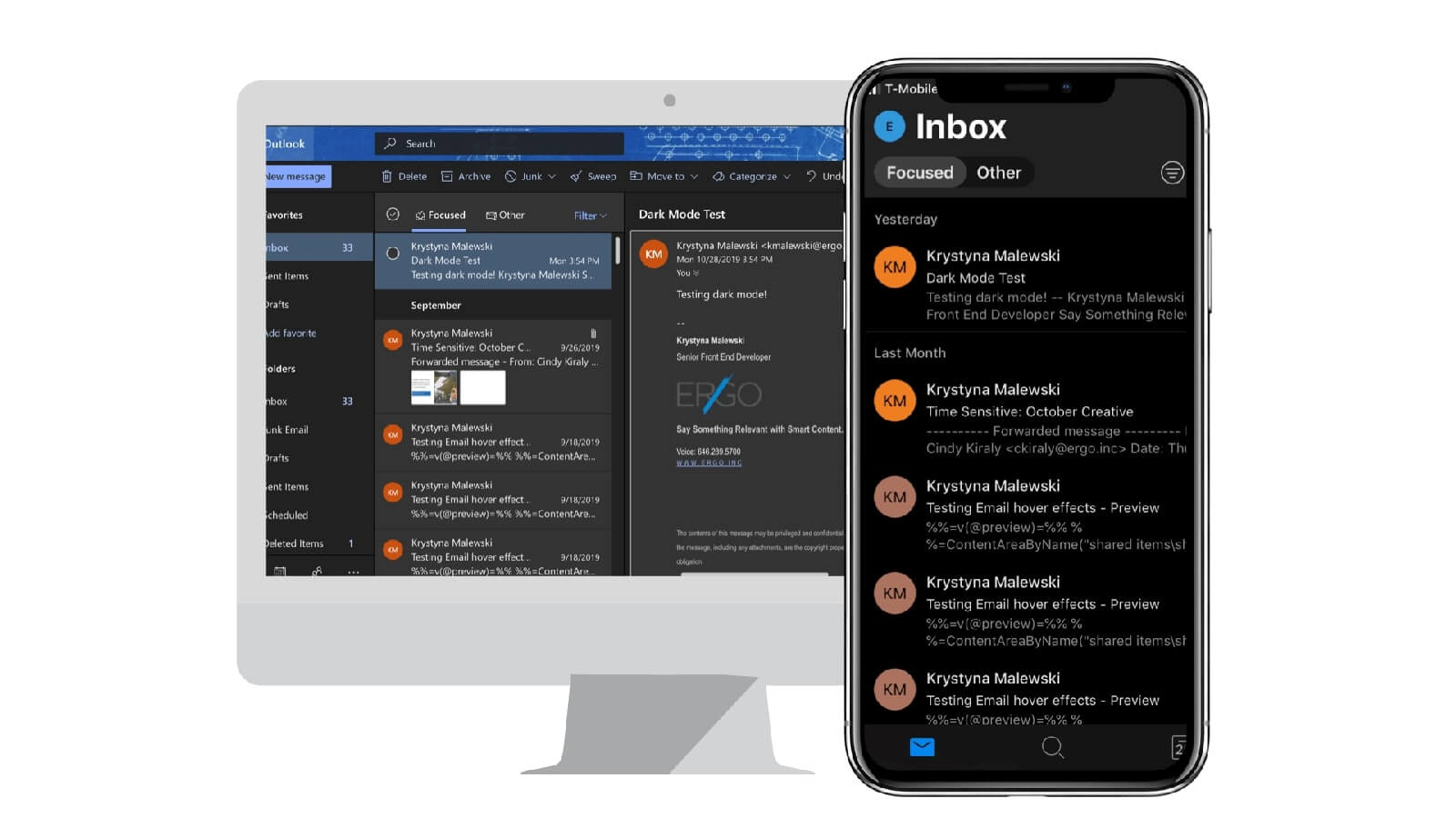
Apple Mail and Outlook desktop, as well as Outlook mobile apps (Android and iOS) and Outlook.com all support some form of Dark Mode, which can mean one of three things:
No changes to your email design
Some clients, such as Gmail (Android, iOS, and webmail), Yahoo!, and AOL webmail, allow users to select a dark UI, but won't alter the code of the emails or how they're rendered.
Apple Mail also won’t change HTML emails as long as there’s an image of at least 2x1 px in the code, and it will render them in light mode by default. Apple Mail does support @media (prefers-color-scheme), so Dark Mode styles can be coded in if you want to do that. Keep in mind, though, that for any plain-text emails Apple Mail will invert the color scheme to Dark Mode.
Partial-color inversion
Outlook.com will only convert light backgrounds with dark text to Dark Mode. It will leave dark-colored backgrounds with light text since they are already a darker design.
Full-color inversion
Outlook 2019 on desktop will completely invert the colors, meaning that it will not only turn light backgrounds to dark, but will strangely enough turn dark backgrounds light.
With the rise in support of @media (prefers-color-scheme), it may be tempting to code your emails to force a light design even in Dark Mode, but that ultimately is going against the customer’s wishes and giving them a negative experience. If someone has their device set to Dark Mode, it’s best to work to accommodate them
Here are a few tips:
1. Use transparent images.
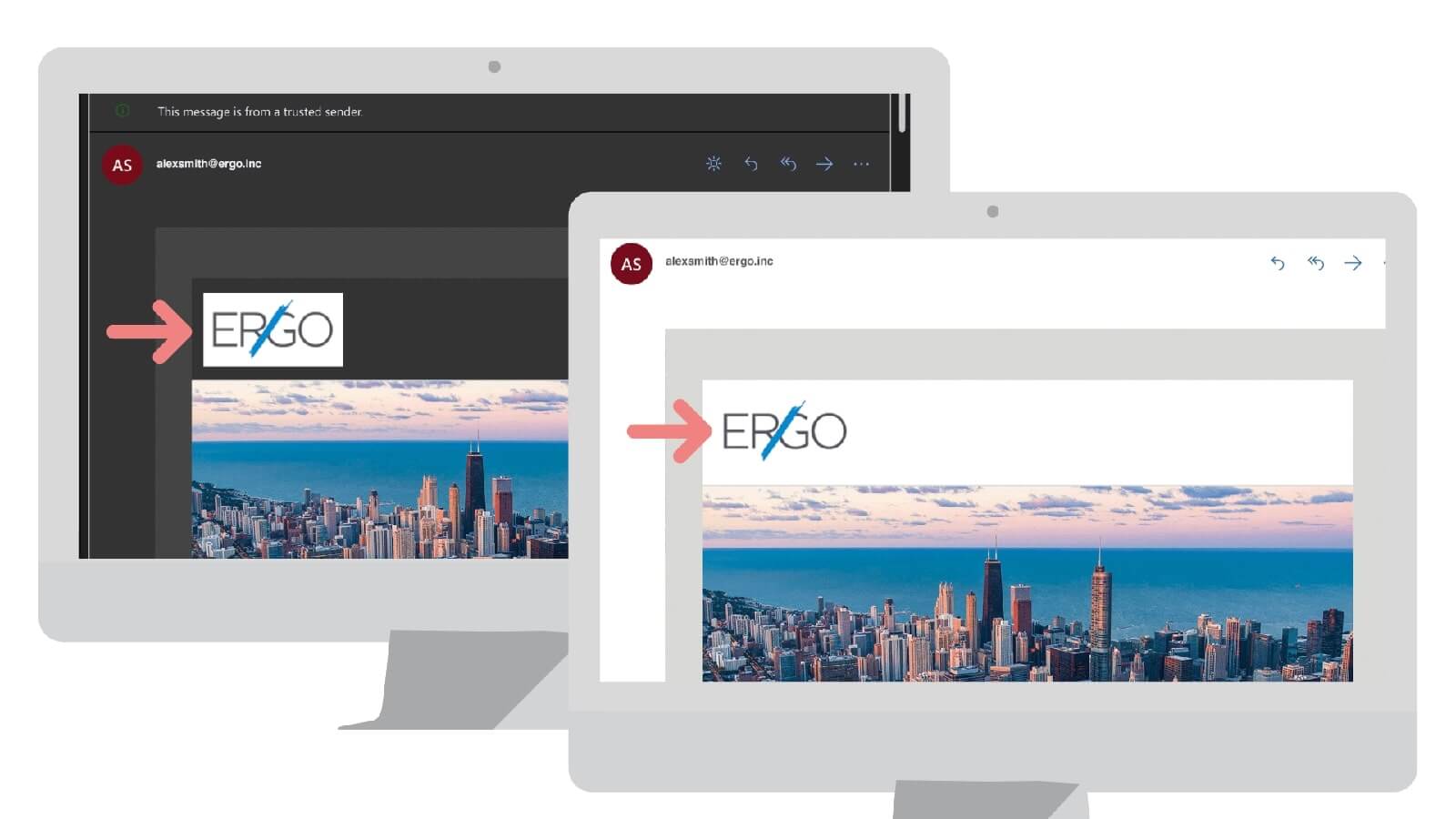
If you’re using an image with a colored background, that background is going to become very awkwardly evident once a device is in Dark Mode. Try to use transparent images for a more seamless transition.
2. Avoid mixing images and background colors.
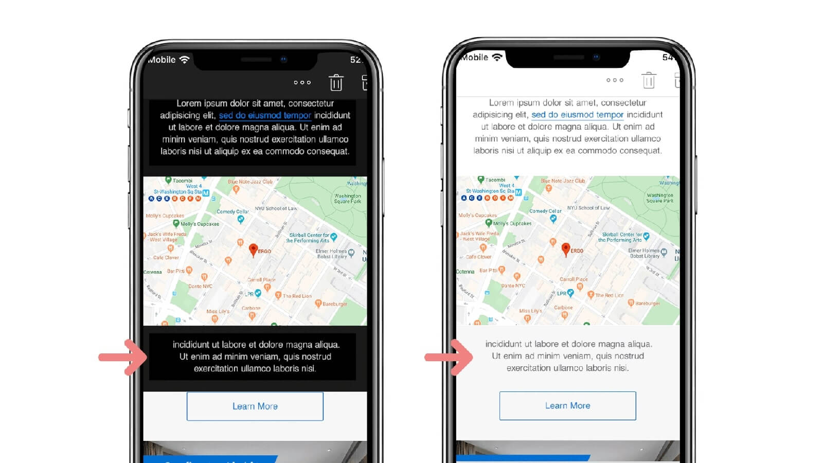
Often, images are used along with background colors to achieve an asymmetrical shape or design element that can’t easily be achieved in a traditional HTML table layout. This becomes problematic in Dark Mode since the background color will be inverted but the image will remain the same, creating a broken design.
3. Add a white stroke around your dark fonts and icons to help them stand out in Dark Mode.
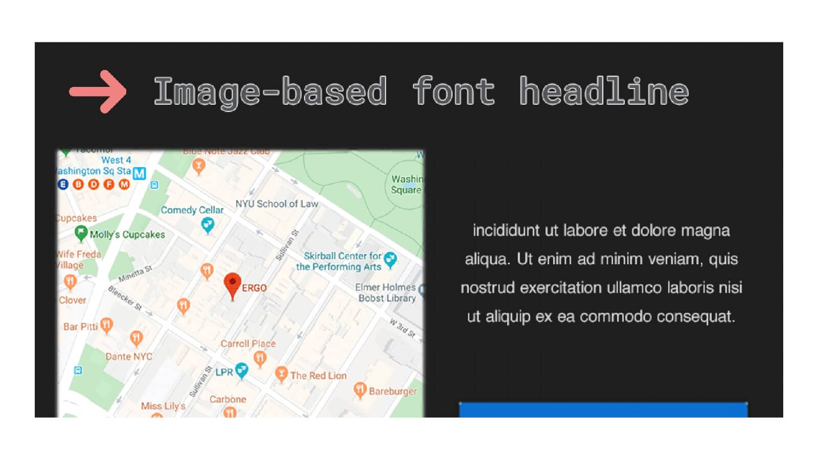
When choosing a font it’s best to stick with system fonts since they’ll adjust automatically for Dark Mode. If you do use an image of a non-system text, trying adding a white stroke around darker fonts. The white stroke won’t be visible in lighter settings, but in Dark Mode it'll help define your text and make it easier to read.
4. Make sure to test your email designs.
It can be hard to be sure how your email design is going to show up in Dark Mode, so make sure you do tests. This will help you catch any unattractive backgrounds, or text or graphics that may be hard to see.
Those are just some things we're watching out for and implementing for our clients, and we can't wait to see what new trends and ideas come from email marketers embracing "the dark side."
Send us your emails and
we'll put them through their Dark Mode paces.