Top 10 Email Marketing
Design Trends
for 2020


Written By Jackie Dunning Vice President, Content & Strategy
January 30, 2020
Contributors: Krystyna Malewski, Claire Safran, Sarah Montini
A new decade calls for reflection and for looking toward the future. We’ve seen a lot of changes in the email platform and email marketing in the last ten years, but what can we expect in the year to come? Take a look below to see some of the top trends 2020 will bring for email marketing and start testing them now!
Party in the Front! What’s making emails look finger-licking good? Design & Content Trends
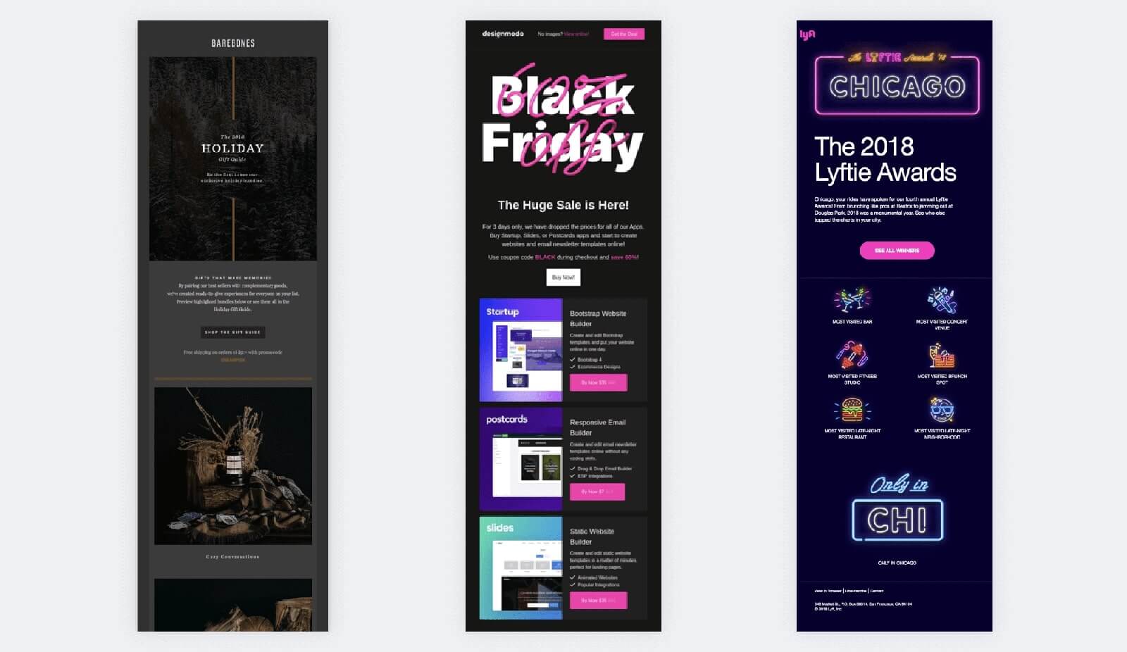
1. Darker Designs
http://reallygoodemails.com/
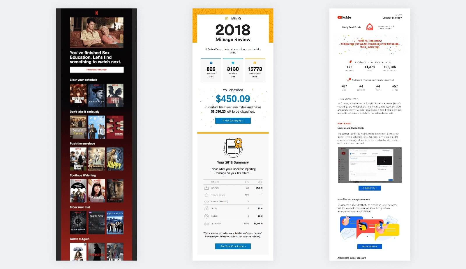
With Dark Mode becoming more and more the norm, it’s no surprise that darker designs are also growing in popularity. On top of that, darker screens are much easier on the eyes. The blue light we’re used to staring at causes a lot of eye strain, and it triggers parts of our brains that make it hard to get to sleep or relax. Darker designs cause less strain, allowing the reader to focus better and keep eyes on your content longer.
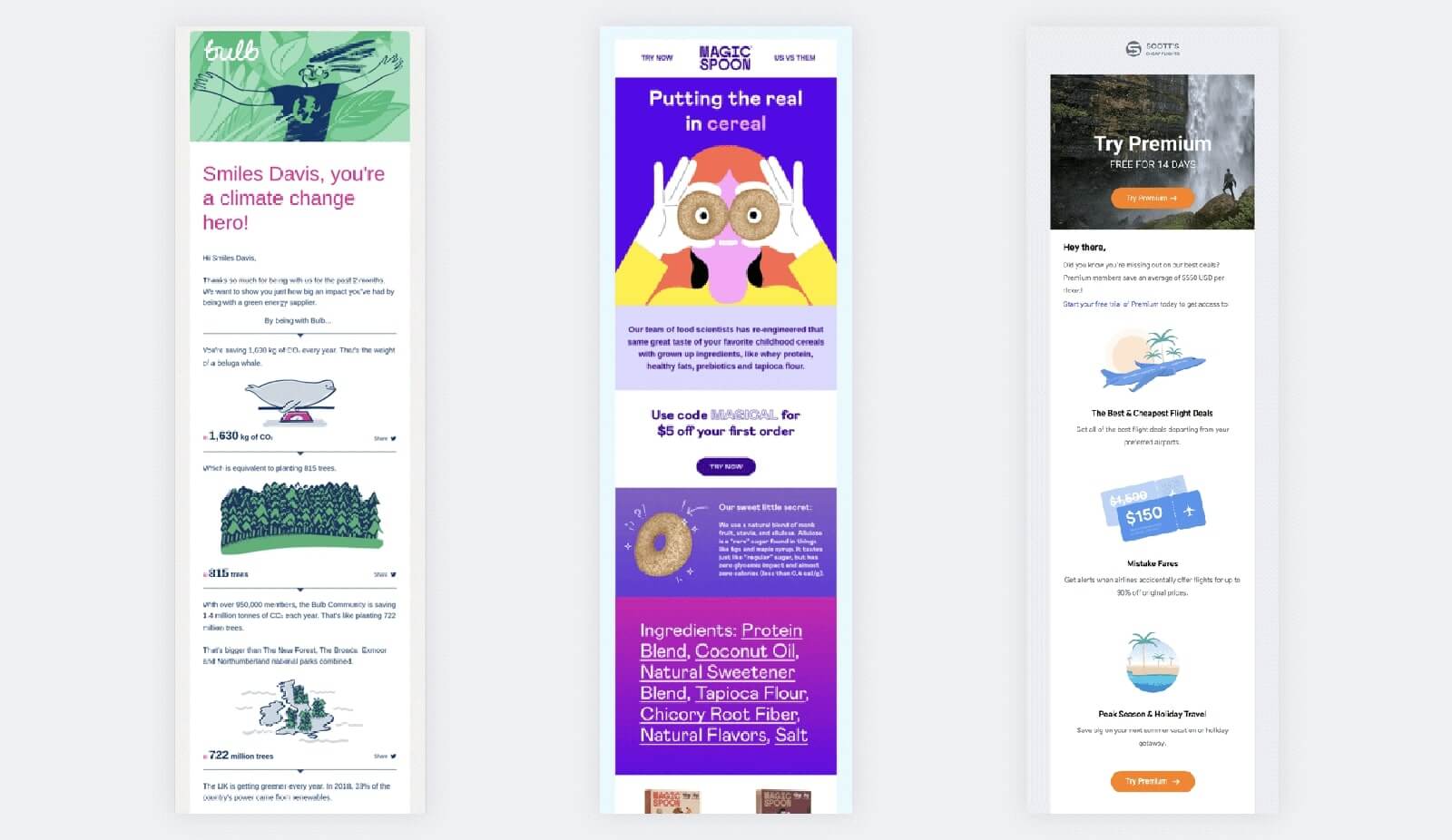
2. Custom Illustrations
http://reallygoodemails.com/
Try as it might, stock photography almost always comes off feeling like, well, stock photography. Custom illustrations can bring brand values to life and allow for more integration with personalized data insights. It also can be easier to highlight diversity in illustrations than in photography. Bonus: Illustrations can be very cost-effective.
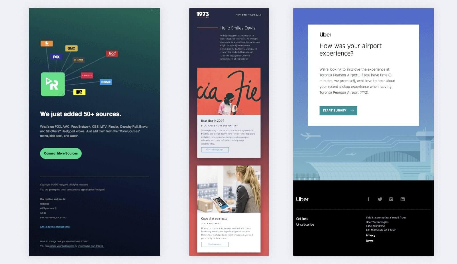
3. Subtle Gradients
http://reallygoodemails.com/
Yes, gradients are back, but this time a lot of them are leaning darker (see: Darker Designs. Gradients add depth to emails, making them more visually interesting and eye-catching. They can lead the reader to focus on the main message, and they can also reinforce an overall brand aesthetic.
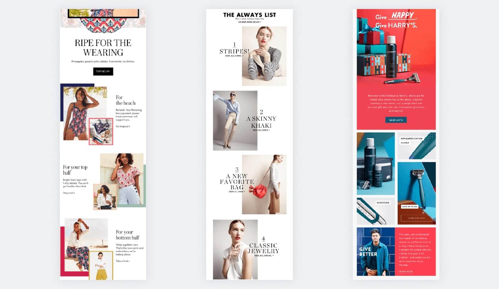
4. Going Off the Grid
https://litmus.com/blog/trending-in-email-design-going-off-grid
Symmetry is so last decade. We’re seeing more designs with overlaps and asymmetry. It creates dimension in an email, and it helps your message stand out in an inbox full of formulaic grids. This is fully compatible with ERGO's Smart Content methodology and our MindReader™ platform.
5. User-Generated Content (UGC)
https://emaildesign.beefree.io/user-generated-content-in-email/
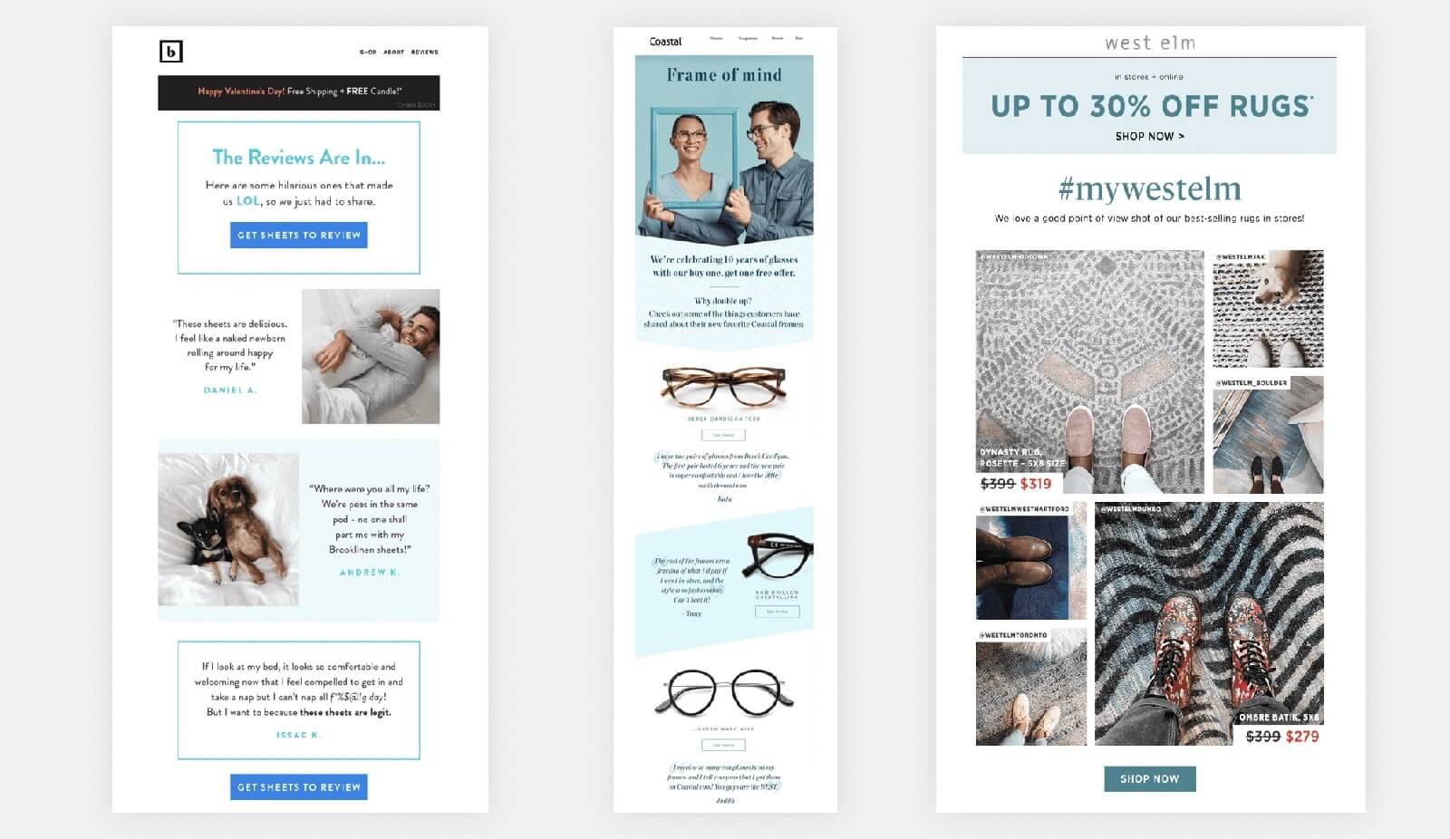
UGC appeals to many consumers because it feels more trustworthy. Including use cases and testimonials from people who have already bought the product or service proves that whatever you’re selling works. You can point out what your bestsellers are, or include customer reviews or ratings so readers can get a real-life opinion.
6. Humor as an Attention-Grabber
https://sleeknote.com/blog/humor-in-email-marketing
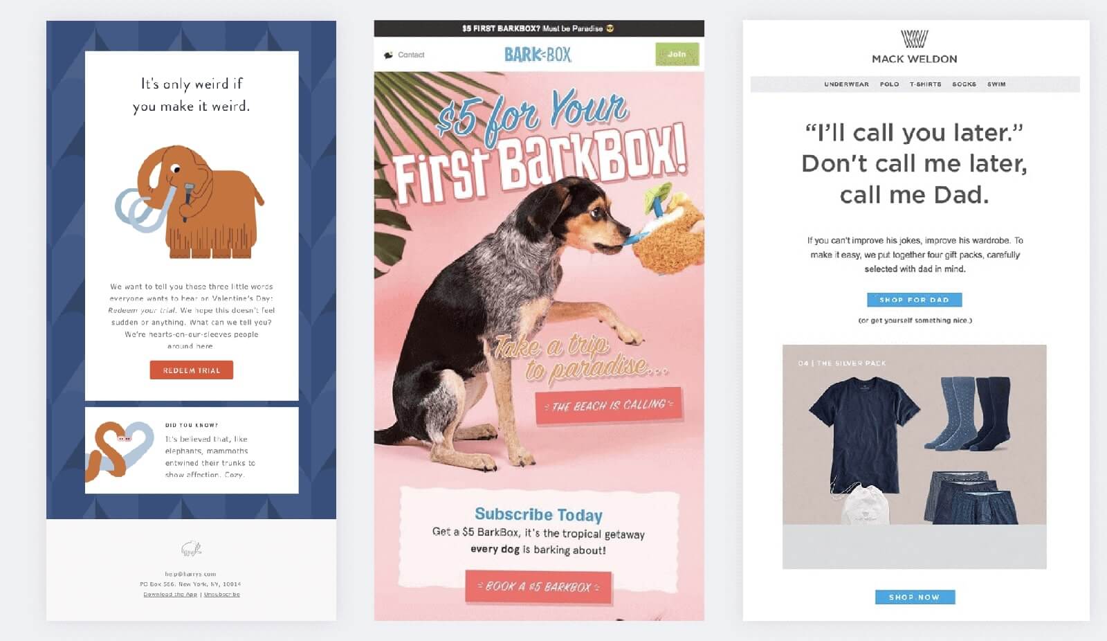
It's no secret that everyone "loves to laugh" (LOL). We suggest bringing that to the inbox and adding some humor to what can sometimes feel like a chore—catching up on emails. As long as it's on-brand, a funny subject line and overall narrative can stand out in a sea of selling. Just keep in mind the humor needs to be in context with your brand. Nobody needs a dad joke from their bank. Bonus: If Siri is reading the email it's even funnier.
The Business in the Back: What’s powering a seamless user experience?Tech Trends
7. Interactivity & Animation (and APNGs)
http://reallygoodemails.com/
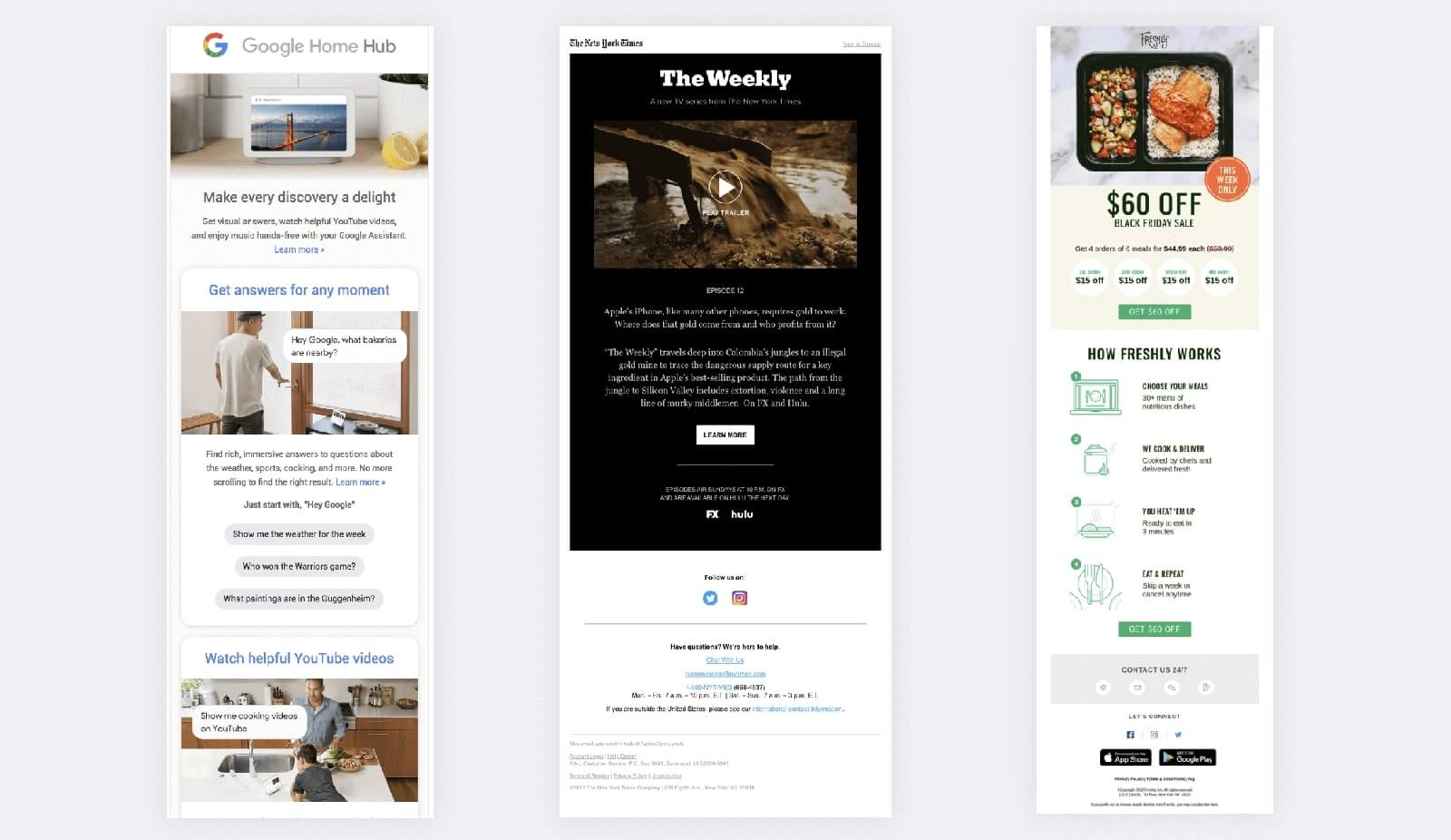
We know, we know, an email is not a website. But with AMP for email still simmering there’ll be even more app-like experiences right in the inbox. And increasing support for APNGs will bring more animation options into emails. Animations and interactive elements can also be useful in demonstrating how a new feature works, and can help you to “show” not “tell.” With interactivity comes a new engagement metric too: time spent in the email. Handy if your click-through experience isn't quite aligned with your content.
8. Accessibility
http://reallygoodemails.com/
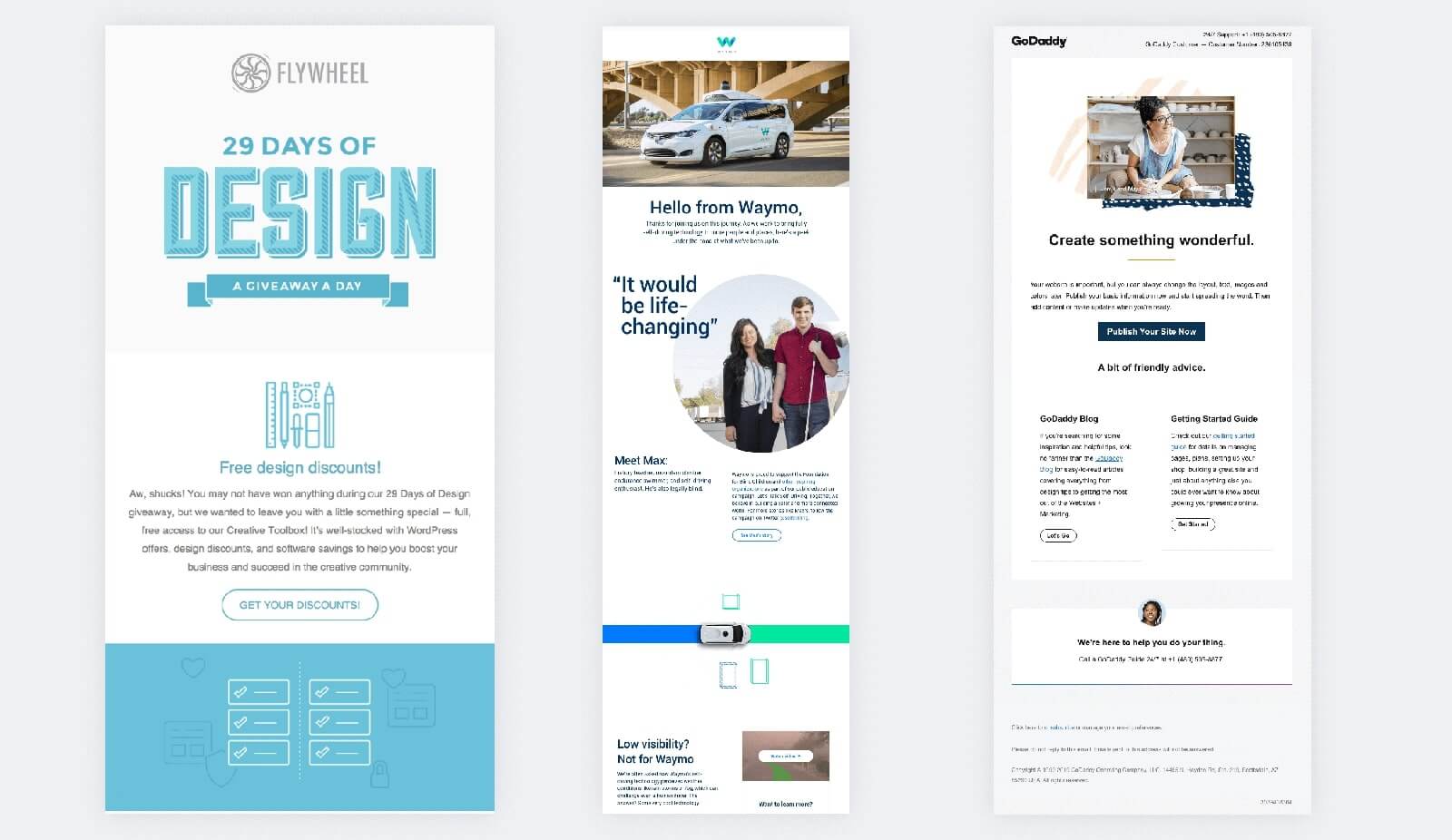
With email being checked everywhere from wristwatches to car dashboards, accessibility is key in making sure you’re reaching people where they are. This means improving readability for people who are scrolling through email on their phones on a crowded subway (think bigger font sizes, high contrast colors, and optimizing line spacing), and making sure accessible code is in place for screen readers to easily digest your content. This requires system text inherent in HTML content versus text embedded in images. Using semantic tags such as <h1> and <p> help to improve the flow of your messaging when reading through a screen reader, and adding role=“presentation” to your tables helps screen readers understand that this is not a data table.
9. Read-Aloud Emails
http://reallygoodemails.com/
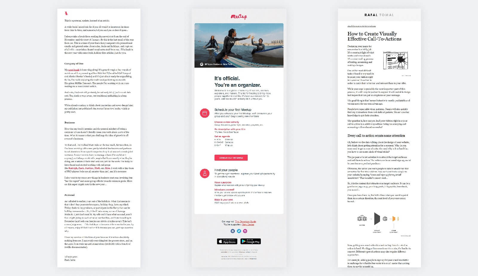
With the ever-growing popularity of smart speakers such as Amazon Echo, Siri, and Google Home, (yes, we know, we're being listened to and cloned) comes having your electronic assistant read your emails. This is a huge help for the visually impaired, but is also being used widely by everyone (including my mom). Ensuring emails are built in a way that works with being read out loud by smart speakers is more important than ever. This means eliminating emojis and images, and ensuring your emails have punctuation so that the voice assistant doesn’t read the copy as one long sentence
10. Hyper-Personalization & Smart Content
https://litmus.com/blog/trending-in-email-design-going-off-grid
Less a trend, more ERGO’s reason for being, is Smart Content. It’s unsurprising that the more relevant something is to you, the more likely you are to engage with it. People are inundated with countless generic emails, so when an email is super personalized and relevant at the time of open, it will drive more engagement and revenue for your brand. By focusing on what's inside the email at the modular level, we deliver hyper-relevance that drives 5X engagement in the channel.
Find out more about Smart Content and how we can help you with your email campaigns right here.
